Grid block is one of the container blocks that can be used to organize multiple blocks and adjust the height, width, and position of all blocks inside the container. As a container block, it’s possible to transform a Grid block into a Group, Row or Stack block without changing the content of the block.
Click the block inserter (+) icon to open the block inserter pop-up window and search for the Grid block.?You can also use the keyboard shortcut /grid to quickly insert a Grid block.
Detailed instructions on adding blocks can be found here.
Block Toolbar
To view the block toolbar, click on the block, and the toolbar will be displayed.
Every block comes with unique toolbar icons. These block-specific controls allow you to manipulate the block right in the editor.
The Grid block shows the following buttons in the block toolbar:

- Transform to
- Moving handles
- Align
- Options
Transform to

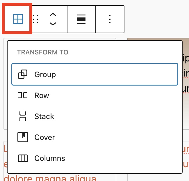
Click on the “Transform” button to convert the Grid block into Group, Row, Stack, Cover or Columns blocks.??
Moving handles
The dotted icons can be used to drag and drop a block to the place of your choosing. The up and down arrow icons can be used to shift a block up and down in your document.

Get more information about moving a block within the editor.
Align

Use the change alignment tool to change the width of the Grid block. The following is a list of the block width options:
- None
- Wide width
- Full width
Options
The Options button on a block toolbar gives you more features to customize the block.
Read about these and other settings.
Block settings
The block settings panel contains customization options specific to the block. To open it, select the block and click the cog icon next to the Publish button.

Click Group, Row, Stack button in the Block Settings to transform the Grid block to each block.?

Layout
The Grid block provides Layout settings options to change the number of columns in the Grid block.
- Auto – Automatically the number of columns is defined by the value specified in Minimum column width.
- Manual – The number of columns is set at Columns field.


Position
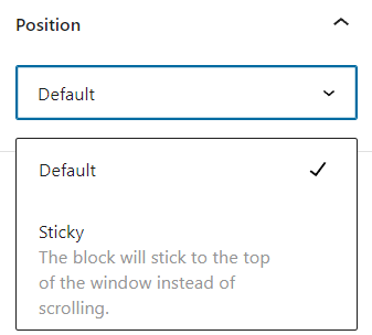
The position setting is only available when the Grid block is located at the root-level. The drop-down menu has two options: Default and Sticky. If the Sticky option is selected, the Grid block will remain at the top of the window when you scroll down the page.

Advanced
The Advanced tab lets you add HTML anchor and CSS class(es) to your block.
HTML element lets you choose the HTML element you want to be used for the block’s wrapper in the HTML code.
HTML anchor allows you to make a unique web address just for this block, Then, you’ll be able to link directly to this section of your page. This can be helpful for longer pages where visitors might want to click on a link to go directly to a specific section.
The Additional CSS class(es) lets you add CSS class(es) to your block, allowing you to write custom CSS and style the block as you see fit.

Block Styles
Click Styles icon in the block settings sidebar to access the design settings.

Color
The Grid block provides Color settings options to change the text, background, and link colors.
For details, refer to this support article: Color settings overview

Background Image
The Grid block provides Background Image settings to display behind the block’s content:
- Click Add background image under the Background Image in the block’s Styles.
- Select image from Media Library or Upload an image.
- You can set Top and/or Left position, and Size from Cover, Contain and Tile.
Typography
The Grid block provides typography settings to change the font family, appearance, line height, letter spacing, decoration, letter case, and font size.
For details, refer to this support article: Typography settings overview
Dimensions
The Grid block provides dimension settings options to add padding, margin, and block spacing.
For details, refer to this support article: Dimension settings overview
Border
The Grid block provides border settings options to add border color, width, and radius.
For details refer to this support article: Border settings overview
Changelog
- Created 2024-08-24